Type of course:
Digital learning, Lesson
Language:
EN
Duration:
15 minutes
Workload:
2 hours
Proficiency:
Advanced
Target:
Professionals, Students, Workers
In Industry 4.0, the purpose of data visualization is to simplify the interpretation of complex data sets through automated visual representations, enhancing data comprehension and decision-making. Advanced visualization dashboards serve as enabling technology, facilitating insight discovery and operational efficiency. Tools like Tableau, Power BI, QlikView, D3.js, Sisense, and Grafana are popular for their diverse capabilities, from user-friendly interfaces and extensive data connectivity to powerful visualization and interactive features. They aid in improved data analysis, effective communication of insights, and efficient resource management. When choosing a data visualization tool, considerations include ease of use, data connectivity, visualization options, interactivity, customization, and collaboration capabilities, ensuring the tool aligns with specific user needs and data analysis requirements. The objectives of the nugget are: to explain the purpose of data visualization in Industry 4.0 to explain different factors when considering which tool to use.
Learning outcomes
- Learner who has completed the nugget is able to understand which data visualization tools are used in manufacturing industry and their key features.
- Learner who has completed the nugget is able to present business cases of data analytics in manufacturing industry.
Course Content
Topics
Transversal Skills, Entrepreneurship

Related
-
 Beginner
How to be an INTRApreneur
By Faculty of Engineering of University of PortoUnleash your entrepreneurial spirit within the corporate landscape through our intrapreneurship course. Master the art of innovative thinking, risk-taking, and resourceful problem-solving. Learn to drive change, incubate new ideas, and navigate challenges within your organization. Elevate your career by becoming an intrapreneurial trailblazer. Join us to cultivate invaluable skills that redefine success from within.
Digital learning, Path- Course Certificate
49 € -
Beginner
Kuidas olla ettevõtja?
By Faculty of Engineering of University of Porto - University of TartuLiberte o seu espírito empreendedor dentro do panorama empresarial através do nosso curso de intra-empreendedorismo. Domine a arte do pensamento inovador, da assunção de riscos e da resolução de problemas com recursos. Aprenda a promover a mudança, a incubar novas ideias e a enfrentar os desafios da sua organização. Eleve a sua carreira tornando-se um pioneiro intra-empresarial. Junte-se a nós para cultivar competências inestimáveis que redefinem o sucesso a partir do interior.
Digital learning, Path- Course Certificate
49 € -
Intermediate
Come essere un INTRAPRENDITORE
By Faculty of Engineering of University of PortoLiberate il vostro spirito imprenditoriale all'interno del panorama aziendale attraverso il nostro corso di intrapreneurship. Padroneggiate l'arte del pensiero innovativo, dell'assunzione di rischi e della risoluzione dei problemi. Imparate a guidare il cambiamento, a incubare nuove idee e a superare le sfide all'interno della vostra organizzazione. Elevate la vostra carriera diventando un pioniere dell'intrapreneurship. Unitevi a noi per coltivare competenze inestimabili che ridefiniscono il successo dall'interno.
Digital learning, Path- Course Certificate
49 € -
Intermediate
Como ser um INTRAempreendedor
By Faculty of Engineering of University of PortoLiberte o seu espírito empreendedor dentro do panorama empresarial através do nosso curso de intra-empreendedorismo. Domine a arte do pensamento inovador, da assunção de riscos e da resolução de problemas com recursos. Aprenda a promover a mudança, a incubar novas ideias e a enfrentar os desafios da sua organização. Eleve a sua carreira tornando-se um pioneiro intra-empresarial. Junte-se a nós para cultivar competências inestimáveis que redefinem o sucesso a partir do interior.
Digital learning, Path- Course Certificate
49 € -
 Intermediate
Processes on how to plan and strategize your first start-up in the manufacturing sector
By MADE Competence Center Industry 4.0 - BGI - CleantechThis course teaches students how to create successful business models that maximize profit and minimize risk. Students will learn about business concepts, model and process implementation, team screening, market competition, and scalability. This course is beneficial for entrepreneurs, business managers, and anyone who wants to develop technical skills in high demand today. Upon completion, students will be well-prepared to tackle modern business challenges and thrive in their industries.
Digital learning, Path- Course Certificate
49 € -
 Beginner
Introduction on self-training methods
By Centro Tecnológico de Automoción de Galicia - MADE Competence Center Industry 4.0 - OESIAThis Learning Path explores fundamental concepts and hands-on applications of self-training in the industrial context, with a special focus on cutting-edge technologies like Augmented Reality. From finger-tracking gloves to Magos solutions, Hololens applications, and Vuforia development, this course guides you through a dynamic learning path. You will gain practical insights on safe usage, integration, and even explore the creation of AR applications
Digital learning, Path- Course Certificate
49 € -
 Beginner
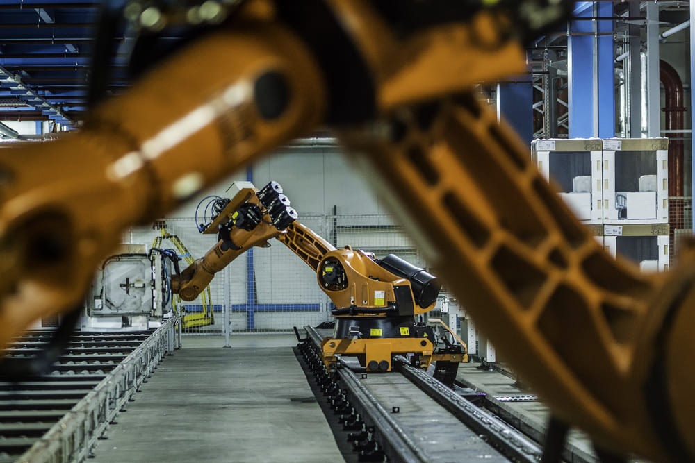
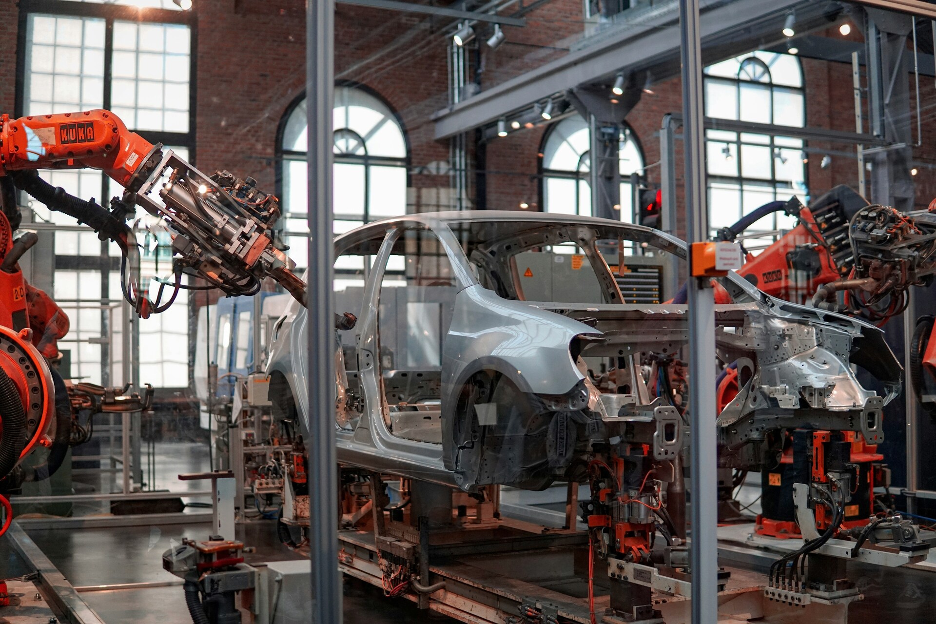
Industrial robotics
By Czech Technical UniversityThis learning path consists of following topics: 1. Basic knowledge about cobots in the matter of differnces between industrial robots and their usage in industry 2. Safety rules of cobots
Digital learning, Path- Course Certificate
49 € -
 Intermediate
Intelligentne protsessi jälgimissüsteem tootmisdefektide tuvastamiseks
By Politecnico di TorinoSee uudsus on intelligentsete otsustusvõimetega masinnägemispõhiste kontrollisüsteemide põhjalik uurimine, mis rõhutab nende praktilist sobivust tööstuslikeks rakendusteks. See sisaldab kolme peamist õpitulemust: Esiteks annab see õpilastele meisterlikkuse protsesside jälgimise põhimõtetest, mida rakendatakse tootmisprotsessides. Õpilased saavad põhjalikud teadmised põhiprintsiipide, tööriistade ja tehnikate kohta, mis on vajalikud tootmistoimingute erinevate aspektide tõhusaks jälgimiseks ja kontrollimiseks.
Digital learning, Lesson -
 Intermediate
Tehnoloogiate ja ettevõtete vastavusse viimine
By INESC TECSee aspekt asetab erilise tähelepanu sellele, et luua terviklik arusaam tehnoloogia kohandamisega seotud dünaamikast ja sellest, kuidas nad suhtlevad kasutuselevõtva ettevõttega juurutamisprotsessi ajal.
Digital learning, Lesson -
 Intermediate
Minimaalselt elujõulise toote lähenemisviis
By Faculty of Engineering of University of Porto - Faculty of Engineering of University of PortoSee tükike selgitab MVP lähenemisviisi kontseptsiooni ja selle lõpuleviimise samme.
Digital learning, Lesson -
 Beginner
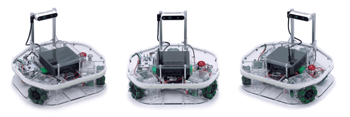
Robotont - avatud mobiilne robot õppe- ja teadustööks
By University of TartuRobotondi tehniline kirjeldus (sh roboti ehitus, liikumismehanism ja tajurlahendus) ning ülevaade võimalikest rakendusvaldkondadest.
Digital learning, Path- Course Certificate
49 € -
 Intermediate
Come creare prodotti e servizi eccellenti
By Faculty of Engineering of University of Porto - Faculty of Engineering of University of PortoQuesto nugget illustra le fasi chiave del ciclo di vita di prodotti e servizi, in modo da sapere quando è il momento giusto per iniziare il processo di sviluppo.
Digital learning, Lesson